
Last Updated on Nov 2, 2020
A bar chart or bar graph is a chart/graph that presents categorical data with rectangular bars with heights or lengths proportional to the values that they represent. The bars can be plotted vertically or horizontally. A vertical bar chart is also called a line graph.
A bar graph shows comparisons among discrete categories. One axis of the chart shows the particular categories being compared, and the other axis represents a measured value. Some bar graphs present bars clustered in groups of more than one, showing the values of more than one measured variable
Bar graphs/charts provide a visual presentation of categorical data. Categorical data is a grouping of data into discrete groups, such as months of the year, age group, shoe sizes, and animals. These categories are usually qualitative. In a column bar chart, the categories appear along the horizontal axis; the height of the bar corresponds to the value of each category.
Types of Bar Charts
-
Grouped Bar Graphs
-
Stacked Bar Graphs
-
Dot Graphs
Grouped Bar Graphs
In a grouped bar chart, for each categorical group, there are two or more bars. The bars are color-coded to represent a specific grouping. For example, a business owner with two studios might make a grouped bar chart with different colored bars to represent each studio: the horizontal axis would show the months of the year and the vertical axis would show the revenue. Usually, a grouped bar graph presents the information in the same order in each grouping.
To understand the above types of bar graphs, consider the following examples:
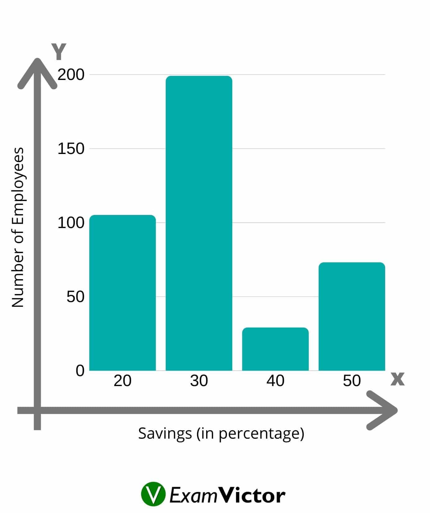
Example: In a firm of 400 employees, the percentage of monthly salary saved by each employee is given in the following table. Represent it through a bar graph.
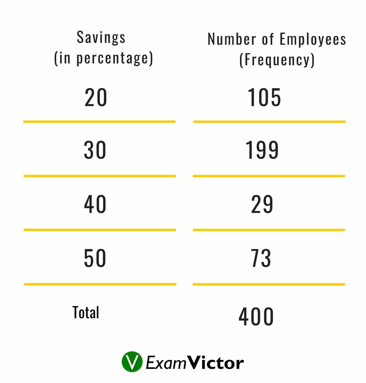
Bar Graph Table
Solution: The given data can be represented as
Stacked Bar Graphs
In a stacked bar chart, bars that represent different groups on top of each other. The height of the resulting bar shows the combined result of the groups. However, stacked bar charts are not suited to data sets where some groups have negative values. In such cases, a grouped bar chart is preferable. Usually stacked bar graphs present the information in the same sequence on each bar.
Dot graphs
A dot graph is one of the simplest ways to represent information pictorially, yet it is the graph that is least used. Figure 8 is an example of a dot graph. As you can see, the message and the information behind the graph are delivered quickly and easily to the reader.
This video lays out the basics of Bar-charts uder Data Interpretation section. Understanding this topic well is necessary to solve questions that are asked in various competitive exams in the Data Interpretation section - applicable to CAT, XAT, MAT, SNAP, IIFT, CLAT, AILET, DU LLB, any other entrance exam as well. For more such content, visit our website - examvictor.com
We hope this video was helpful and if you liked this video, you can check more videos here. Please let us know your views in the comment section below.